Unique Restaurant Logo Design for Frijol De Oro | Murk Studio
The client, Frijol De Oro, sought a brand that would set their restaurant apart in the market. They envisioned a premium yet affordable brand, reflecting premium service and ingredients while remaining accessible to their community. They aimed to provide premium local food without it being overly expensive, all while employing and supporting the local workforce.
Client Background:
Frijol De Oro considered the needs of their town, desiring to offer premium local cuisine without breaking the bank. They were committed to making a positive impact in their community by hiring and empowering local workers.
Project Goals:
Design a unique logo and brand identity reflecting the restaurant’s nature and premium ingredients.
Create a brand that looks premium yet remains affordable for the average customer.
Process:
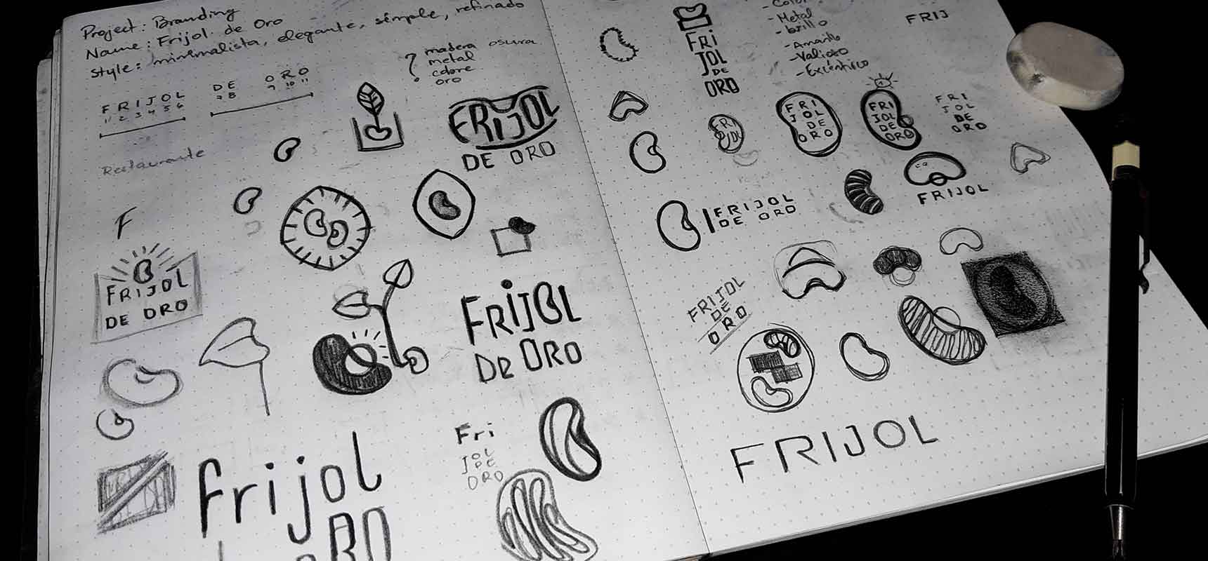
The logo design process began with sketches and reference images to guide the path. Sketching played a crucial role in exploring various concepts for the logo design.
The Result:
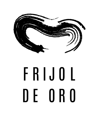
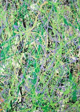
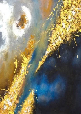
Restaurant Logo Design with Abstract Expressionism Influence
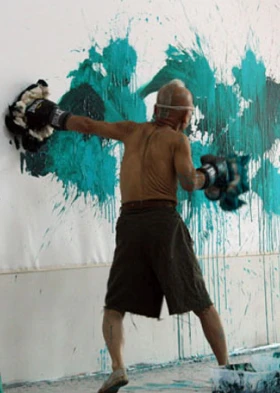
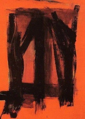
In the process of the restaurant logo design, we found inspiration in the art style of “abstract expressionism,” known for its emotional depth. Our goal was to create a balanced design that blends contrasting elements to convey passion in a clear way.
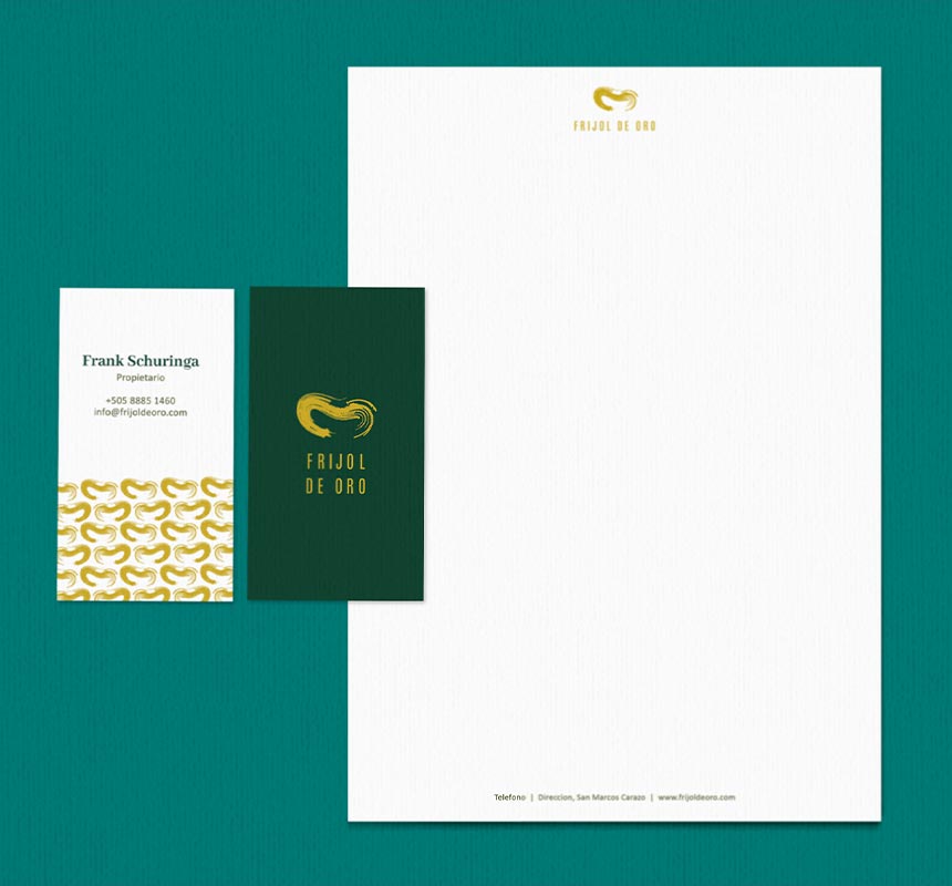
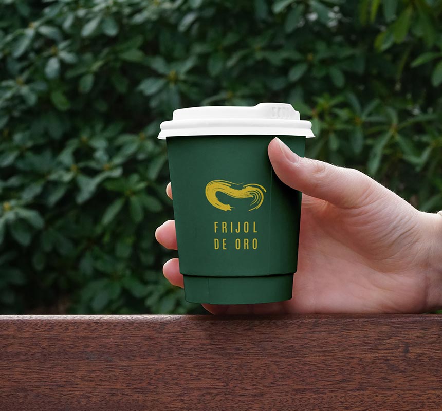
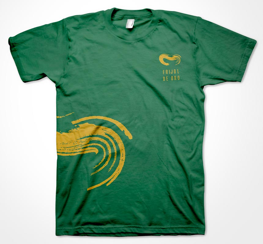
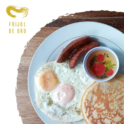
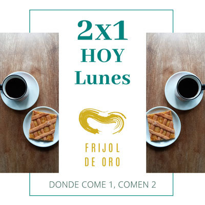
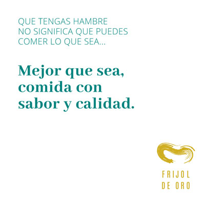
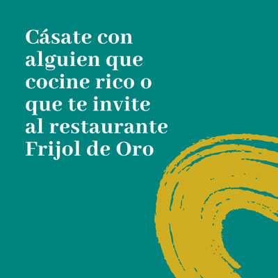
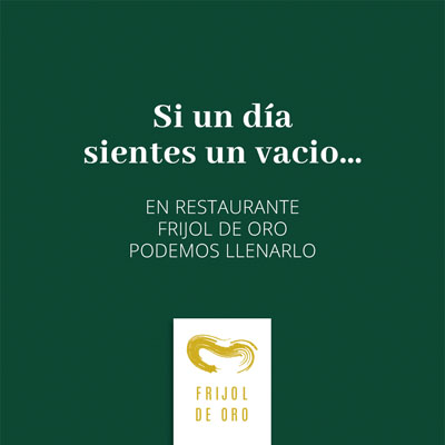
The logo itself features a bright golden color against a calm green background, creating an interesting contrast. Its simple and modern design, with a clean sans-serif font, gives it an elegant and contemporary look.
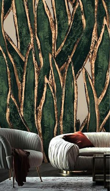
The color palette we chose reflects the natural vibe of the restaurant, with green foliage tones that match its ambiance. Each color was carefully picked to resonate with the restaurant’s focus on enjoying nature.
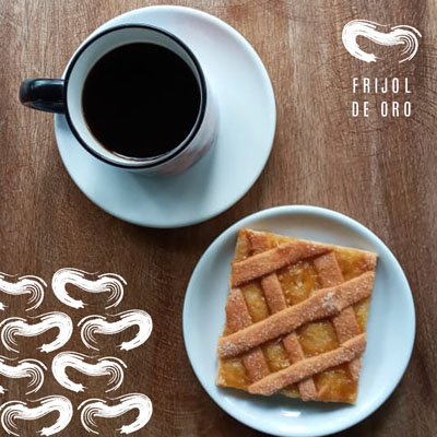
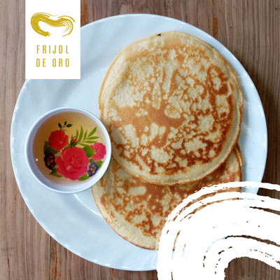
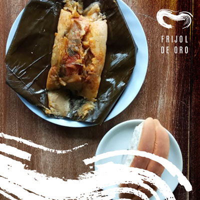
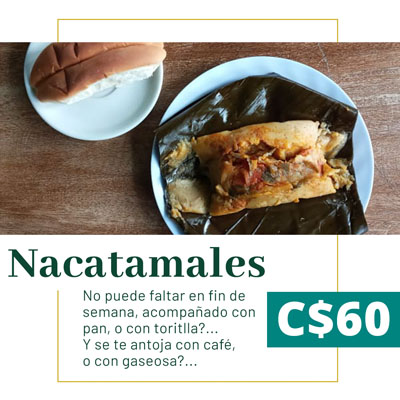
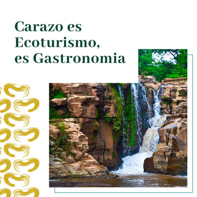
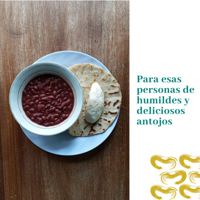
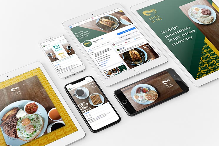
To add a bit of flair, we developed a subtle pattern based on the logo’s elements. This pattern, meant for decorative use, gives the brand a cohesive look across different applications.
Overall, the logo design captures the essence of the restaurant, blending simplicity with a touch of sophistication. The bright golden color pops against the green backdrop, creating a striking visual impact that resonates with the restaurant’s focus on quality and natural elements. The clean and modern design, paired with the earthy green tones, reflects the restaurant’s ambiance of a welcoming and nature-inspired space. The subtle pattern adds a touch of uniqueness, creating a cohesive visual identity for the brand.
During the project, challenges such as balancing premium and affordability were encountered. These challenges were overcome by carefully selecting color palettes and design elements that conveyed both aspects.
Client Feedback:
The client and their family were pleased with the presented concepts, ultimately choosing the “Abstract Expressionism” concept. They appreciated the support and patience Murk Studio provided throughout the project.
Conclusion:
Unique restaurant logo design delivered.
Client’s expectation of a different logo design for the town met.
Exceptional service and support provided to entrepreneurial clients.
This case study demonstrates Murk Studio’s expertise in delivering captivating and unique restaurant logo designs. We specialize in creating logos that strike a perfect balance, resonating with premium quality while remaining accessible and affordable to our clients. Our designs are tailored to capture the essence of each restaurant, ensuring a distinctive and memorable brand identity. Through our meticulous process, we bring ideas to life, creating logos that leave a lasting impression on customers.
Ready to take the next step? Schedule a meeting with us today to discuss your own design needs