CASE STUDY
Refined Branding & Logo Design for Calala | Murk Studio

Client Background:
With a keen eye for detail and a deep understanding of unmet market needs, the client sought to establish a clothing brand that would encapsulate the essence of tropical femininity. Her approach was to harness the skills of local craftsmen to produce women’s attire that was not just wearable but was also an emblem of the strength and beauty of the women in her community. This brand was to stand as a testament to quality, local craftsmanship, and the powerful narrative of its wearers.
Project Goals:
The primary objective was to create a logo and branding system that epitomized the sensual beauty and inherent strength of classy tropical Latino women. The design needed to transcend local boundaries and position the brand as a global contender in the fashion industry, resonating equally well across diverse markets.
Process:
The journey to the final logo design involved an intricate process of sketching combined with a detailed study of various typefaces. This exploration was critical to discovering a typeface that would precisely express the characteristics of elegance and resilience, pivotal to the brand’s identity. This phase ensured the logo would not only look appealing but also embody the spirit of the brand in every curve and line.
The Result:
Simple Yet Sophisticated: Fashion Brand & Logo Design Mastery
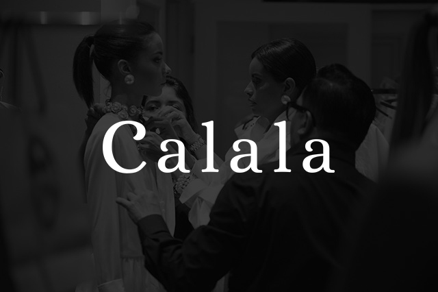
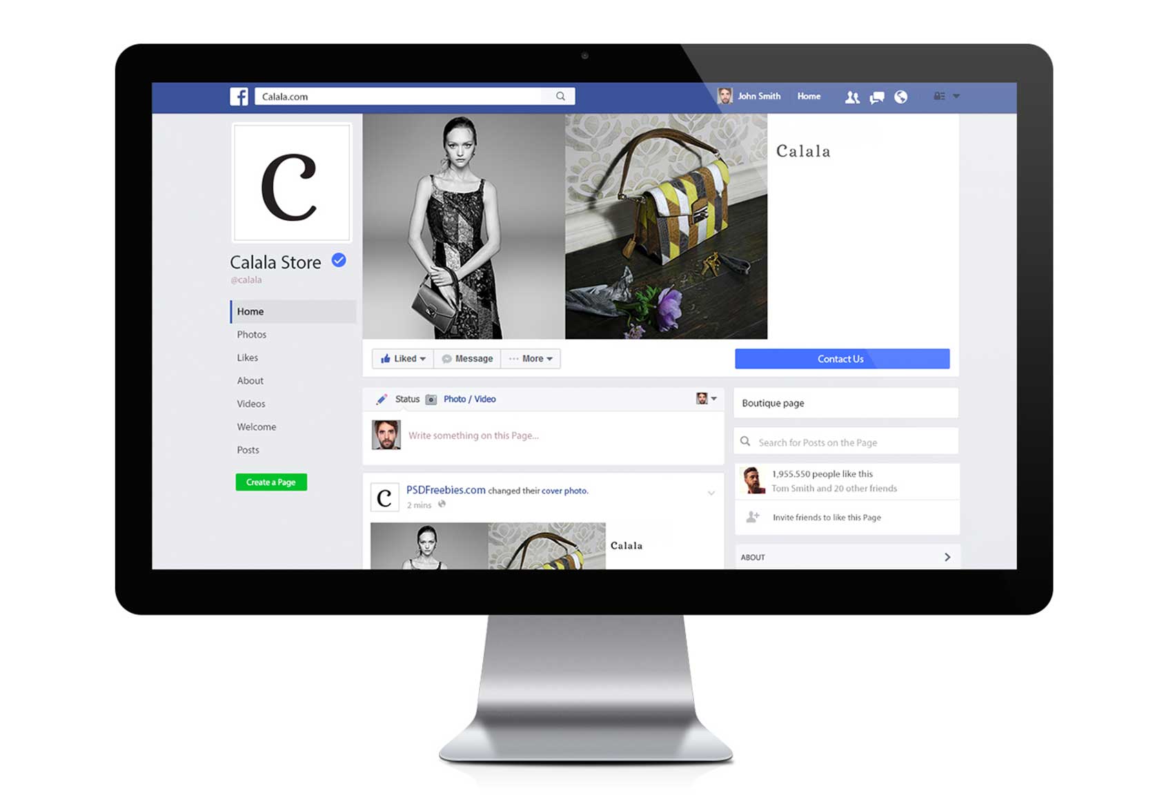
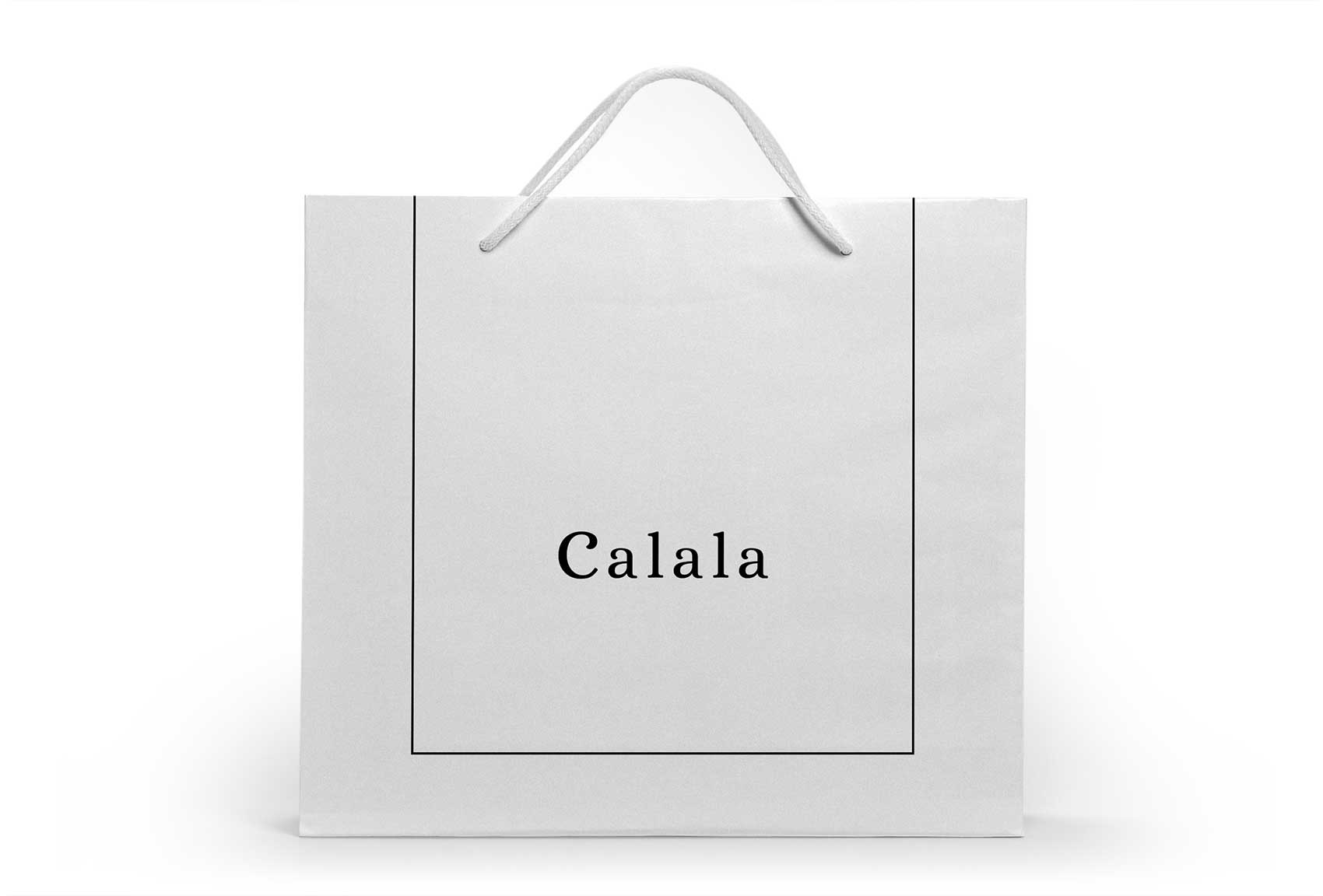
Our final logo design for the fashion label gracefully integrated cues from female proportions, employing a voluptuous, curvy serif typeface set in a simple yet sophisticated layout. The design established a balanced visual rhythm, with letter heights specifically chosen to enhance the brand’s name visually.
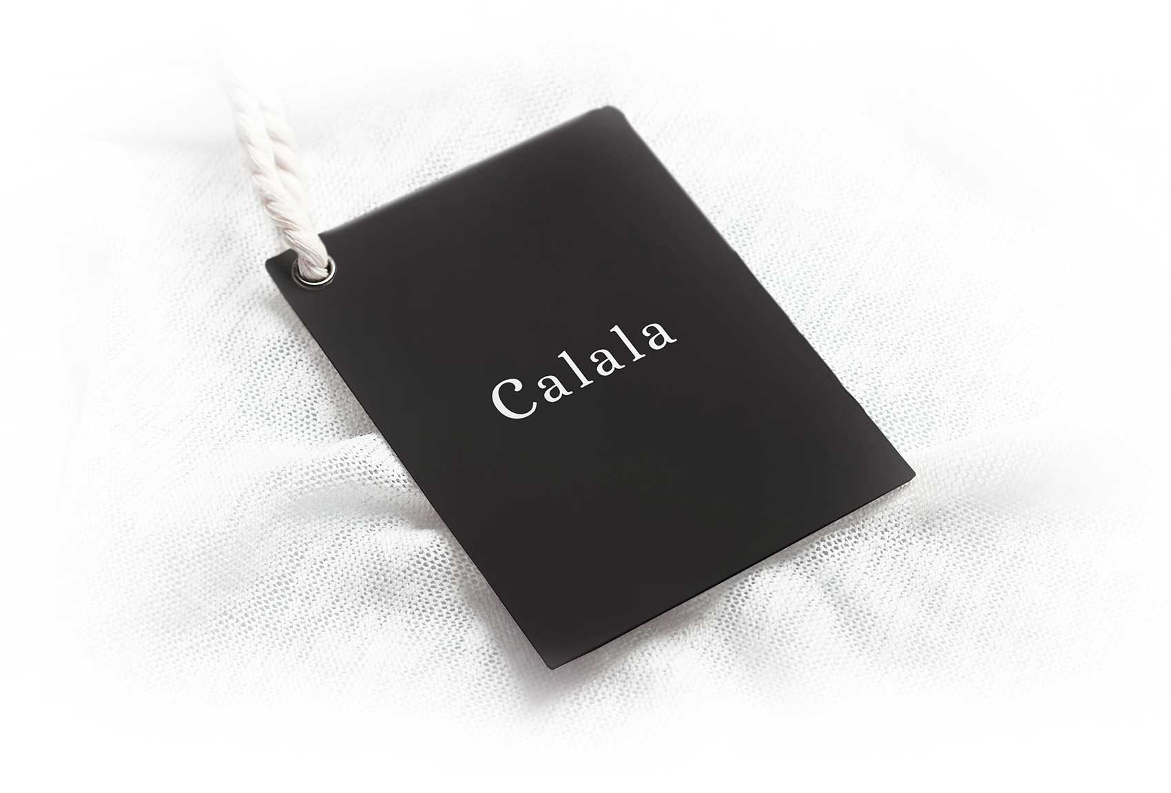
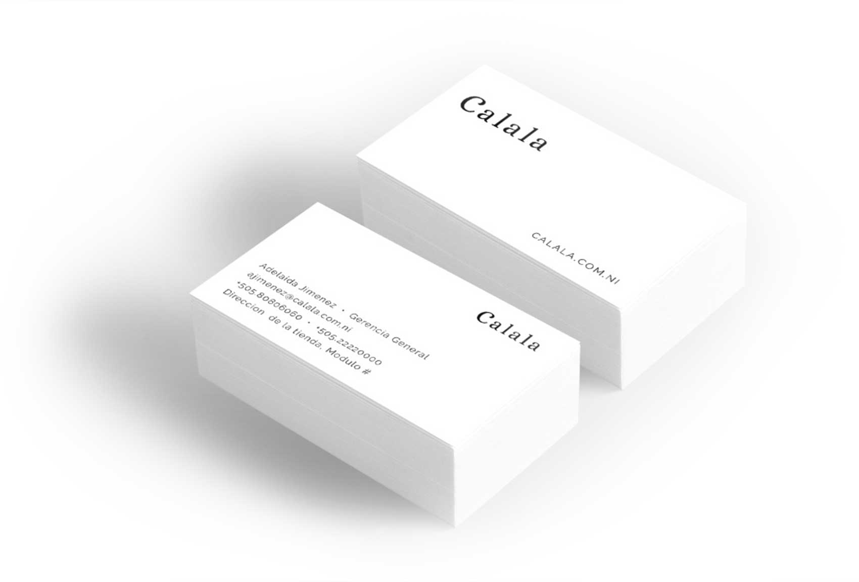
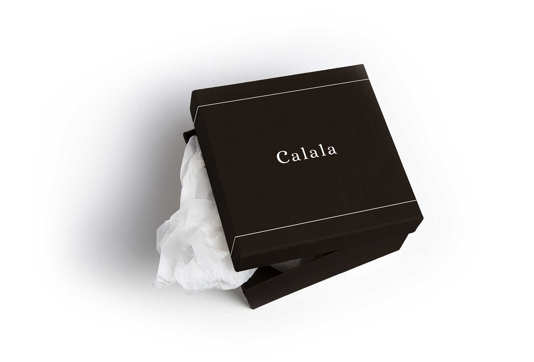
The logo is predominantly showcased in a classic black on a white background, with an alternate inverted color scheme for special applications such as labels. A subtle line, matching the color scheme, frames the logo, adding an extra layer of finesse.
Adhering to a minimalistic two-color scheme, the logo leverages the powerful contrast of black and white, achieving a timeless sophistication that facilitates versatile applications across various mediums.
Furthermore, the logo’s design process involved meticulous attention to detail, ensuring that every curve and line captured the essence of the brand’s identity. This dedication to craftsmanship resulted in a logo that not only resonates with the target audience but also stands the test of time in the competitive fashion industry.
Challenges and Solutions:
The task was to create a logo that stood out for its simplicity and expressiveness while being constrained to a black and white palette, and still exuding class and femininity. The solution involved extensive experimentation with different font weights and spacing. The team ultimately chose a serif font that conveyed sophistication and used spacing to create a feeling of openness and elegance, ensuring the logo would hold its ground in international markets.
Conclusion:
Our journey with the client culminated in delivering a logo and brand design that distinctively sets the brand apart in a competitive market. This project went beyond merely creating a visual identity; it built a lasting partnership with the client, allowing us to continuously observe and contribute to the brand’s thriving success.
Our case study highlights Murk Studio’s prowess in crafting sophisticated branding and logo designs for Calala, a premier women’s clothing brand. With a focus on custom logo design solutions, our expert team ensures a perfect blend of premium quality. Each design is meticulously tailored to encapsulate Calala’s essence, guaranteeing a unique and memorable brand identity. Through our meticulous process, we bring ideas to life, leaving a lasting impression on customers.